

Looking to create a captivating atmosphere in your home theater? One of the easiest ways to do this is to choose the right color scheme. However, many people find this overwhelming as they don’t know where to start or how to choose the right colors. That’s why we’re here to help you out.
In this blog post, we’ll give you some useful tips and tricks to create the perfect home theater color scheme. By the end of this post, you’ll know what colors work well together and how to make them work in your space. So why wait? Let’s dive in and get started on creating the ultimate theater experience in your own home!
Understanding Colors
Choosing the right color schemes for your home theater is crucial in creating the perfect viewing experience. Colors play a significant role in setting the mood and ambiance of the room, and it’s essential to choose colors that match your style and preferences. When selecting colors, keep in mind that darker colors tend to absorb light and create a more intimate atmosphere, while lighter shades tend to reflect light and make the room appear more spacious.
Darker shades of blue, gray, and black are popular choices for home theaters, as they provide a sleek and sophisticated look. Adding a pop of color in the form of accents or accessories can also enhance the feel of the room and add depth. By taking the time to consider color schemes carefully, you can transform your home theater into a visually appealing and comfortable space that the entire family can enjoy.
RGB, CMYK & Hex Values
Colors are an essential part of our lives, and their use is vital in the world of design. Understanding colors can be a tricky process, especially when it comes to RGB, CMYK, and Hex Values. RGB stands for Red, Green, and Blue, which are the primary colors of light.
This color mode is commonly used for digital designs such as websites and phone applications. On the other hand, CMYK stands for Cyan, Magenta, Yellow, and Key (black). This color mode is used for print designs such as brochures, business cards, and flyers.
Hex Values, also known as hexadecimal values, are six-digit codes that represent different colors. They are commonly used in both digital and print designs. One of the most significant differences between RGB and CMYK is how they represent colors.
RGB uses an additive color model, which means that when the three primary colors are combined, they create white. In contrast, CMYK uses a subtractive color model, which means that when combining the four primary colors, they produce black. This is why it’s crucial to convert your colors to the correct format, depending on the design you’re creating.
Hex Values, the six-digit codes used to represent colors, are also essential in the world of design. They are commonly used in both digital and print designs and are recognized by most design programs. They represent the amount of red, green, and blue in a color, respectively, and allow for precise color matching.
In conclusion, understanding colors, their modes, and their representations are vital in design. Whether it’s RGB, CMYK, or Hex Values, each plays a crucial role in ensuring that your designs look their best and are consistent across all mediums. By understanding these principles, you can take your designs to the next level and create visually stunning and effective designs.
Color Schemes That Work Best
When it comes to home theater color schemes, there are several options that work really well. Firstly, a classic black and white color scheme can be a great choice. This will give your home theater a stylish and sleek look.
You can add pops of color with accessories like throw pillows, rugs, and curtains to make the space feel more inviting. Another popular option is to use shades of grey. This can create a modern and sophisticated atmosphere that is perfect for a home theater.
You can also add colorful accent pieces to make the space feel lively and fun. If you want something bold and vibrant, consider using rich jewel tones like emerald green, sapphire blue, or ruby red. These colors will add drama and excitement to your home theater, making it feel like a true entertainment hub.
Regardless of which color scheme you choose, the key is to create a space that is comfortable, inviting, and conducive to relaxation and enjoying your favorite movies and TV shows.
Monochromatic & Analogous
Monochromatic and analogous color schemes are two of the most popular color palettes used in design. Monochromatic schemes are created by using different shades of the same color, resulting in a harmonious and cohesive look. This palette is perfect for creating a clean and modern design.
Analogous color schemes, on the other hand, use colors that are adjacent to each other on the color wheel. This creates a cohesive and balanced design, with a subtle vibrancy that is pleasing to the eye. Analogous schemes work best when the colors are chosen carefully, with a focus on using colors that complement each other.
Both monochromatic and analogous color schemes are incredibly versatile, and can be used in a variety of design applications, including graphic design, web design, and interior design. By understanding the unique properties of each palette, designers can create stunning designs that capture the essence of their brand or message.
Complimentary & Split-Complimentary
When it comes to choosing color schemes for your designs, understanding the basics of complementary and split-complementary colors can help you create visually appealing and balanced compositions. Complementary colors are opposite each other on the color wheel, such as red and green or purple and yellow. Using these pairs can create high-contrast designs and make each color appear brighter.
Split-complementary colors involve choosing one base color and pairing it with the two colors adjacent to its complement, resulting in a more subtle and harmonious palette. For example, if your base color is blue, you could pair it with yellow-orange and red-orange. By understanding how these color schemes work, you can create designs that evoke different emotions and moods depending on the colors selected.
Choosing the Right Palette
When it comes to designing your home theater, choosing the right color scheme can make all the difference in creating the perfect atmosphere. A popular approach is to use darker colors like navy blue or deep burgundy on the walls to create a cozy, immersive feel. However, if you have limited space, lighter colors such as pale gray or cream can help create the illusion of a larger room.
It’s important to also consider the colors of your furniture and decor to ensure they complement your chosen wall color. If you’re unsure where to start, consider taking inspiration from your favorite movies or theater designs to find the perfect home theater color scheme for you. Keeping in mind your preferences and the overall style of your home, you can create a unique and inviting space that will be the envy of all your friends and family.
Considering Room Size & Lighting
When it comes to choosing the right color palette for a room, there are a few things you need to keep in mind, such as the size of the room and the type of lighting you have. For smaller rooms, it’s best to stick to lighter colors as they can make the space feel larger and more open. However, if you have a larger room, you can experiment with darker shades and jewel tones to create a cozy and intimate atmosphere.
Additionally, you need to consider the type of lighting you have in the room, natural or artificial. For rooms with lots of natural light, cooler shades work best as they can balance out the warmth of the sun. On the other hand, rooms with little natural light benefit from warmer colors as they can create a cozy and inviting vibe.
So, whether you’re going for a bold and daring color scheme or a calming and soothing one, make sure to keep the size of the room and lighting in mind for the perfect color palette.
Matching Existing Decor
When it comes to matching your existing décor, choosing the right palette is crucial. You want to select colors that blend seamlessly with your current furnishings and accessories. One approach is to opt for a monochromatic palette, which entails selecting a single color as your base and using different shades and tones of that color throughout your space.
This can create a cohesive and harmonious look. Alternatively, you can choose complementary colors, which are those that sit opposite each other on the color wheel, such as blue and orange or green and red. This can create a contrast that adds vibrancy and interest to your space.
No matter which approach you choose, it’s important to consider factors like lighting and room size to ensure the colors you select look their best. With a little bit of thought and planning, you can create a color palette that perfectly complements your existing décor and enhances the overall aesthetic of your space.
Examples of Stunning Schemes
Home theater color schemes can play a huge role in creating the perfect cinematic experience in the comfort of your own home. While some might opt for a traditional black and white color scheme, others prefer to add pops of color to create a more vibrant atmosphere. One example of a stunning home theater color scheme is the “Dark and Moody” scheme, where deep blue and purple tones are used to create a cozy and immersive environment.
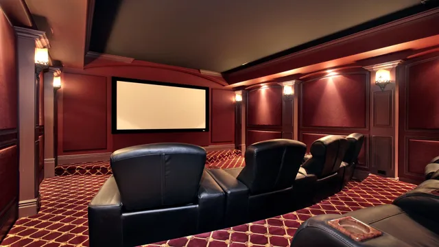
For those who want a more modern and sleek feel, the “Sleek and Chic” scheme utilizes shades of gray and white to create a minimalist look. Another popular option is the “Luxury Theater” scheme, where warm and rich colors like burgundy and gold are used to create a luxurious and sophisticated feel. Whatever your personal style may be, choosing the right color scheme can transform your home theater into a one-of-a-kind entertainment oasis.
Dark & Moody
Dark & Moody color schemes can add depth and sophistication to any space. By using rich, deep hues such as navy, charcoal, and burgundy, you can create an atmosphere that exudes romance and mystery. One great example of a stunning dark scheme is pairing a charcoal gray wall with a deep navy velvet sofa, complete with plush patterned throw pillows.
This creates a cozy yet modern aesthetic that is perfect for a living room or den. Another dramatic option is to use a burgundy accent wall with black and gold accents to create a luxe, brooding atmosphere in a dining room or home office. By playing with texture and contrast, you can create a space that is both dramatic and inviting.
The key to making these schemes work is to balance dark colors with lighter accents and plenty of natural light. With the right touches, a dark and moody room can be the perfect escape from the world outside.
Bright & Vibrant
Bright & Vibrant color schemes are a fantastic way to add energy and excitement to any space. From bold oranges and sunny yellows to bright greens and vivid pinks, there are endless options to choose from when creating a lively color palette. One example of a stunning scheme is incorporating a mixture of teal and coral, which creates a beachy and joyful vibe.
Another option is pairing buttery yellows with crisp whites and touches of navy blue for a nautical-inspired look. No matter which colors you choose, make sure to balance them out with neutral tones like light grays or soft beiges to prevent overwhelming the space. By selecting a vibrant color scheme, you can inject personality and vibrancy into any room.
Neutral & Cozy
If you’re looking for inspiration for your neutral and cozy home decor, we’ve got you covered with some stunning scheme examples. One popular combination is the use of warm beige, creamy white, and soft gray hues. This creates a welcoming and calming atmosphere, perfect for relaxing after a long day.
Pairing these colors with natural materials, such as wood and linen, adds a touch of texture and warmth to the space. Another option is to incorporate pops of muted pastels, like dusty rose or sage green, into the neutral palette. This creates a subtle yet charming touch of color without overwhelming the space.
Overall, a neutral and cozy scheme is all about creating a comfortable and inviting home, and these examples show just how beautiful it can be.
Conclusion
After conducting extensive research on home theater color schemes, it is safe to say that choosing the right colors for your theater room is just as important as picking the perfect film to watch. Just like a director carefully selects a color palette to enhance the mood of their movie, homeowners must also consider the impact of color on their viewing experience. So whether you prefer a classic black and white design or a burst of bold hues, remember that the color scheme you choose can make all the difference in creating an immersive and personalized home theater.
“
FAQs
What are some popular color schemes for a home theater?
Some popular color schemes for a home theater include dark shades of blue, green, red, and gray. These colors help to create a cozy and immersive viewing experience.
How do I decide on a color scheme for my home theater?
When deciding on a color scheme for your home theater, it is important to consider the overall look and feel you want to achieve. You should also take into account the size of the room and any existing decor.
Can I incorporate multiple colors into my home theater color scheme?
Yes, you can incorporate multiple colors into your home theater color scheme. However, it is important to ensure that the colors complement each other and do not clash.
What are some tips for creating a cohesive color scheme in a home theater?
To create a cohesive color scheme in a home theater, you can use a color wheel to determine complementary colors, stick to a specific tone or theme, and use accent colors sparingly. Additionally, you should consider the lighting in the room and how it may affect the color scheme.